Recently updated on January 8, 2025
Attention is a currency, and business competition for this currency is rough and getting rougher with each day.
As the minds of today get oversaturated with information, people become more selective about the online resources they visit. The number of people who value their “informational hygiene” grows, which means that with each day, fight for people’s attention gets more and more complicated. However, nothing to worry about if you remember a simple rule: people prefer resources that deliver the biggest value with the minimum of distractions. Developing digital resources with this rule in mind is necessary for business success.
The only thing to figure out is what people consider to be “the biggest value” regarding a website? What are the elements to make them enjoy surfing a website and return back to it later?

1. Content
So content is important no doubt. And you may think that it is kinda an overstatement to write it here. However, our thesis is not that a website should have content that a user is looking for. Our thesis is that your website needs to have slightly more than that.
Relevant content is a no-brainer here. However, it will benefit a company if its website has more than just a required minimum that users are looking for.
For instance, a blog can add a lot of value to a website. However, if a website has a blog, the content in it should be created to meet the interests and values of the target audience and not only be aimed at promoting the website’s SEO. Blog packed with relevant content will make users trust a website more, and it is much more probable this way users will add the web resource to their browser’s bookmarks.
Another great idea is to implement video content where it is possible. Not only many people prefer video content over text but also integrations of video from youtube can greatly boost SEO. Furthermore, according to HubSpot “visual content is 40 times more likely to be shared on social channels compared to text-based and other traditional formats.” Also don’t forget about other visuals, such as infographics and pictures, as according to this Social Media Marketing report, “32% of marketers say visual images are the most important form of content for their business, with blogging in second (27%).”
In addition, it is important to have an “about us” section on a website with information about the company and/or its creators. It will provide users with a desired sense of familiarity and will start building trust.
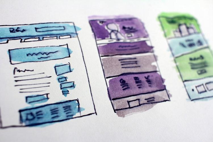
Finally, it is important to develop a website’s UX with content in mind. Mock-ups or wireframes should be created with the understanding of future content to ensure that the latter one is delivered to an end-user in the most efficient way.
2. Intuitive Navigation
A website may have the best content ever created, but if its navigation is infuriatingly inconvenient, a lot of people will close the resource after several seconds of frustrating browsing. People value their time, and convenient UX design proves that website owners actually care about it.
Ensure that a website has a clear menu and easy-to-follow structure. Look at eBay, for example. It contains an immense amount of information but still has an intuitive interface that helps to not get lost.
The best way of figuring out whether a digital resource is intuitive is to ask people who have nothing to do with its development to use the website and give their feedback on their experience. Also, you can just ask a person to find something particular on a website and monitor whether he or she faces difficulties in the process.
3. Relevant Design
The appealing, up-to-date design will attract attention, while obsolete one will scare a lot of users away. Not only non-attractive websites are not pleasant to look at but also they create an impression that the resource lags behind in other aspects, such as security, for instance. Design matters a lot.
Also, remember that if you want to redesign a website, it is better to preserve its previous structure and layout of navigational features because of users who are used to the previous version of a website. Redesigns are often met with hostility, and it is normal. However, you can significantly mitigate its backlash by keeping in mind the interests of established users.
It also does not mean that a website should necessarily follow all the trends, but it still better to be appealing and stylish.
4. Social Media Links
Links to social accounts on a website is almost a status quo at this point. Not only do links demonstrate to a user that a company is alive online but also provide a great source of information about an organization. It is convenient for users to learn about the company and its products via social media because people are very used to using them in their everyday life.
In addition, social media offer a great possibility for a company to connect with their customers in a more informal way and get the clients to know the company’s corporate culture better, which can provide an amazing promotion.
This small 5-point checklist provides a minimum that helps to ensure that a user will enjoy interacting with a website. Intuitive navigation with a simple and responsive menu, an easy-to-follow structure, useful and well-thought-out content, and its delivery, stylish design, and social media presence will provide a website with a necessary basis for further success.
Remember, a company that develops digital resources should always prioritize users’ desires if it wants to survive in the modern battle for attention.


